
Carolina Design Realty
Overview
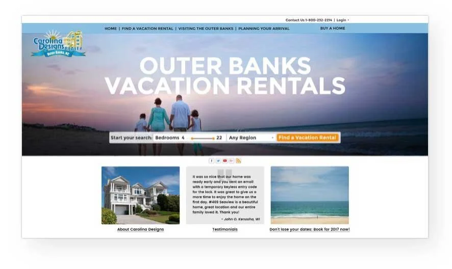
Carolina Designs Realty (CDR) represents Outer Banks vacation homes for short-term rentals. (It is like an Airbnb for the Outer Banks.) They match homeowners with vacation-seeking families and friends.
Responsibilities
User interviews
User research
Information Architecture
Task Flows
Checkout Wireframes
Initial Mockups for testing
Adaptive Visual Design
Key Goal & Timeline
Update the website to position itself more competitively, reduce PPC spending and reflect current desktop and mobile design standards.
6 months (includes development
Process
Stakeholder interviews
PET™ (persuasion, emotion, trust) user interviews
Created user personas
Determined drives and blocks (based on PET™ research) that either encourage or stop users from buying phones or upgrading plans
Created hypothesis on the decision process of users
Created ecosystem of factors that facilitate the decision to lease a house
Finalized personas
Created task flows for booking a house
Created 3 mockups; tested concepts with 30 users
Conducted preference test with 3 mockup concepts
Evaluated results
Mapped information architecture
Created task flow for check out
Designed adaptive website
UX Methods Used
Stakeholder and user interviews
User research
A/B Testing
PET™ research
Ecosystem creation
Personas
Customer journey
Task flows
Information architecture
Navigation
Prototyping
Wireframing
Adaptive visual design
Outcome
The site launched and profits increased 47% ($3.76 million) in just the first 3 months.
Increased satisfaction scores by 80%.
Increased favorable reviews by 45%
UX Research
Ecosystem
Factors that contributed to decision-making when booking a vacation rental were explored.

Information Architecture
Defines navigation and guides the user’s journey
A site audit was conducted, and new architecture was created.
Items outlined in red below required content.
I utilized a legend where orange indicated needed copy.

User Flow

Mockups
Mockups derived from stakeholder interviews, PET™ research, and user interviews were utilized to evaluate initial concepts. These provided insights into what was effective and what was not, serving as the foundation for the final design.
Homepage – 3 versions
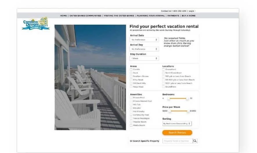
Search criteria page
Search results page
Property page
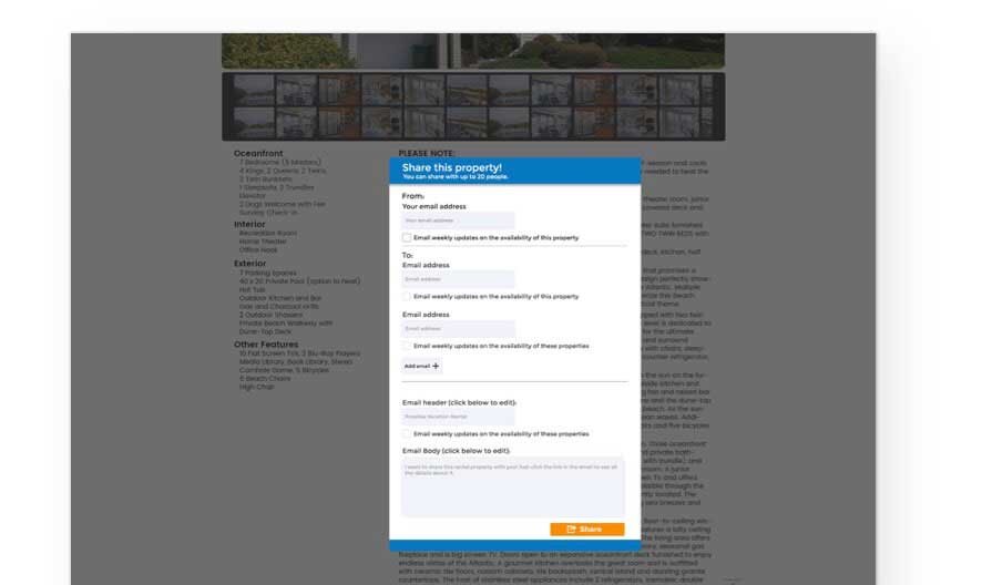
Share property page
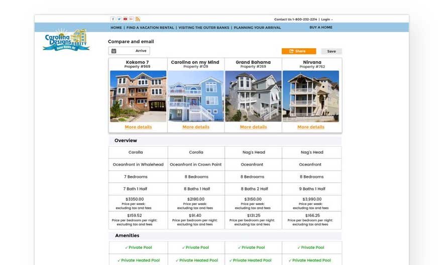
Comparison page
Share comparison page


Visual Design
I used Bootstrap’s 12 column grid for the desktop site and used a large hero image that had been tested with users.

Search Page
Users accessed this page through the homepage. All users tested liked the page. tested.
The search criteria addressed everything users needed to find a home.
I created a “No required fields” message and backend, which users appreciated. It reduced the frustration of dealing with error messages.

Property Details
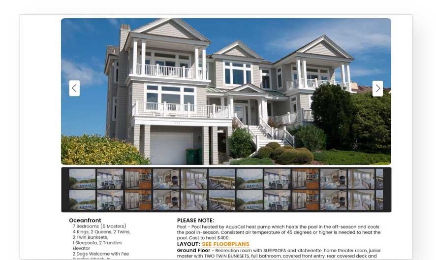
Clicking on a search result displayed the property details.
Users appreciated the large image of the house and the thumbnails for viewing the photo gallery. They found the tabs at the top easily and expected the page to scroll based on their selection. I kept the header fixed so users could click on another tab without difficulty.
Users felt that the information provided was well-balanced and useful for making decisions.

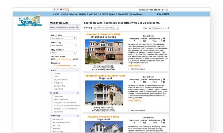
Search Results
The displayed results matched users’ expectations.
I designed the filter using sliders, checkboxes, and accordion menus (which allowed users to expand and close to reveal additional choices).
I included prices per bedroom and per night as it helped users avoid the math and informed their group about how much they needed to pay.
The camera icon was appreciated as a quick way to view photos, and the map icon directed users to a Google Map API.
Users liked the ability to compare up to 10 homes. Comparing homes was not an option on the mobile site, but the language used was positive. It stated, “You can compare houses side by side on your Tablet or Desktop computer.”
